Having found what appeared to be signals from the weather station in the data I captured (read here for more) the next logical step was to try and decode it.
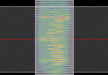
Inspectrum has some useful tools and following an example of analysing data I watched on YouTube, I started by adding a frequency plot (right click, Add derived plot > Add frequency plot). The center of the plot and the spectrum covered can be easily adjusted.
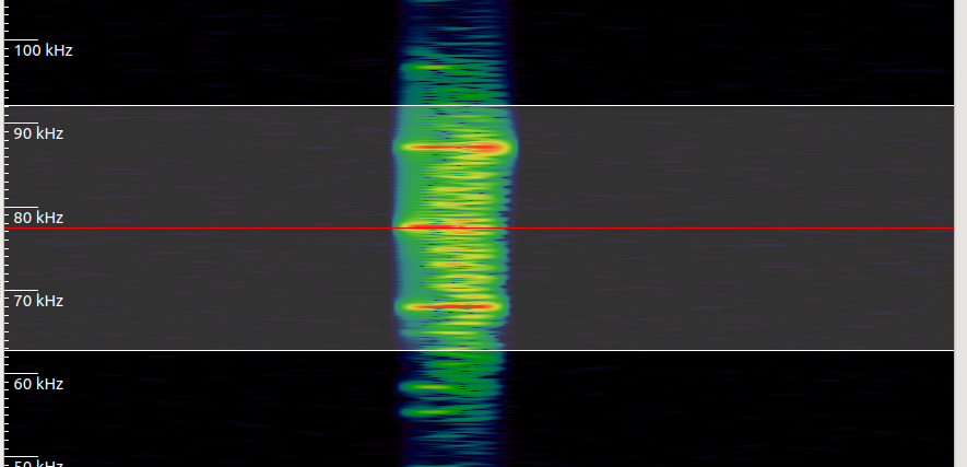
The results showed a defined pattern.
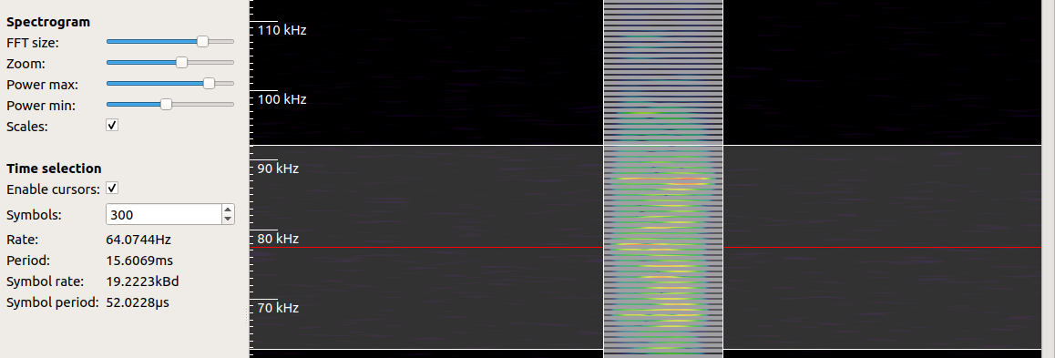
The pattern looked nicely centred so my next step was to try and extract symbols from it. This is done using the Time selection cursor. Prior to enabling this I tried to guess how many symbols I was expecting. From earlier research I knew the transmitted data was reasonably short and likely no more than 20 bytes. As the symbols I would be extracting were bits this meant a figure of 160 would probably be enough. However, when I last tried this I found that there was a significant amount of noise broadcast prior to the actual signal, so I elected to use a figure of 300 symbols to ensure I had a large enough sample.
After enabling the cursor I then adjusted the width of the highlighted area until the rate was close to 19,200.
Right clicking on the frequency plot and selecting Extract symbols > Copy to clipboard then gave me a series of 1's and 0's. For a quick check I pasted these into a new text document, added the preamble sequence I was expecting and tried to find it.
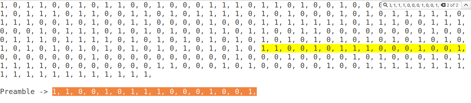
Voila! This proves that I have captured the transmission and that it can be extracted from the raw samples. Now if I can just figure out how to do it in code rather by hand...